// INSIGHTS
VOICE MADE VISIBLE
BY JAMES STERLING · OCT 12, 2024 · 8 MIN READ
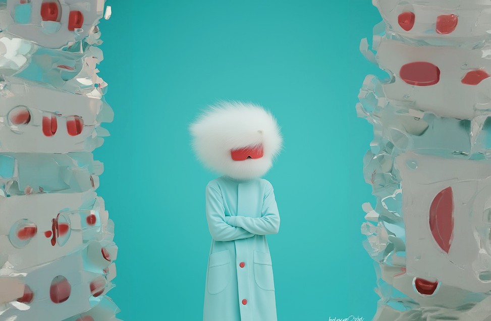
For too long, the corporate landscape has been a sea of safe, uninspired blue logos and generic sans-serif typography. The era of playing it safe is ending, not with a whimper, but with a necessary, aggressive revitalisation of brand essence.
The modern consumer is relentlessly bombarded with visual noise. In this environment, neutrality is invisibility. Brands that attempt to appeal to everyone end up resonating with no one. The pivot towards high-contrast, opinionated design isn't just an aesthetic trend; it's a fundamental survival strategy in an oversaturated market.
EMBRACING THE SHADOWS
We've spent decades trying to illuminate every corner of our brands, presenting sanitised, flawless\ facades. But depth - real, captivating depth-requires shadows. It requires a willingness to acknowledge friction and embrace a sharper, more defined edge. This means discarding the pastels and embracing stark contrasts, aggressive typography, and imagery that evokes emotion rather than just illustrating a feature.
Neutrality is the enemy of memorability. If your brand doesn't stand for something sharp, it stands for nothing at all.
The agencies and studios that will define the next decade understand this. They are building identities that demand attention, using scale, stark minimalism, and raw, unfiltered messaging. It’s an editorial approach to corporate communication, treating every touchpoint as a piece of high-end journalism rather than a sales pitch.


JAMES STERLING
LEAD STRATEGIST
James is a founding partner at the agency, specializing in aggressive brand repositioning for legacy corporations looking to shed their skin.
COMMENT (1)
Spot on. The shift towards opinionated design is overdue.


← PREVIOUS ARTICLE
NEXT ARTICLE →